One model that scores how much a chart lies, submitted to all seven Part 2 categories. A chart can be true in every value and still misrepresent its result. PolyChart measures how much a chart distorts its data, giving every distortion an exact Tufte Lie Factor, signed and continuous, rather than a yes/no label. Everything below is open: datasets and weights on HuggingFace and Kaggle, live demos, the client that drove the whole run, and the research it produced.
Since September 2026 I have been a volunteer ambassador for Adaption Labs — running events and community initiatives, testing new formats and platform features, and carrying member feedback back to the team.
Announced 18 August 2026. Marks and palette are Adaption Labs' own.
The result
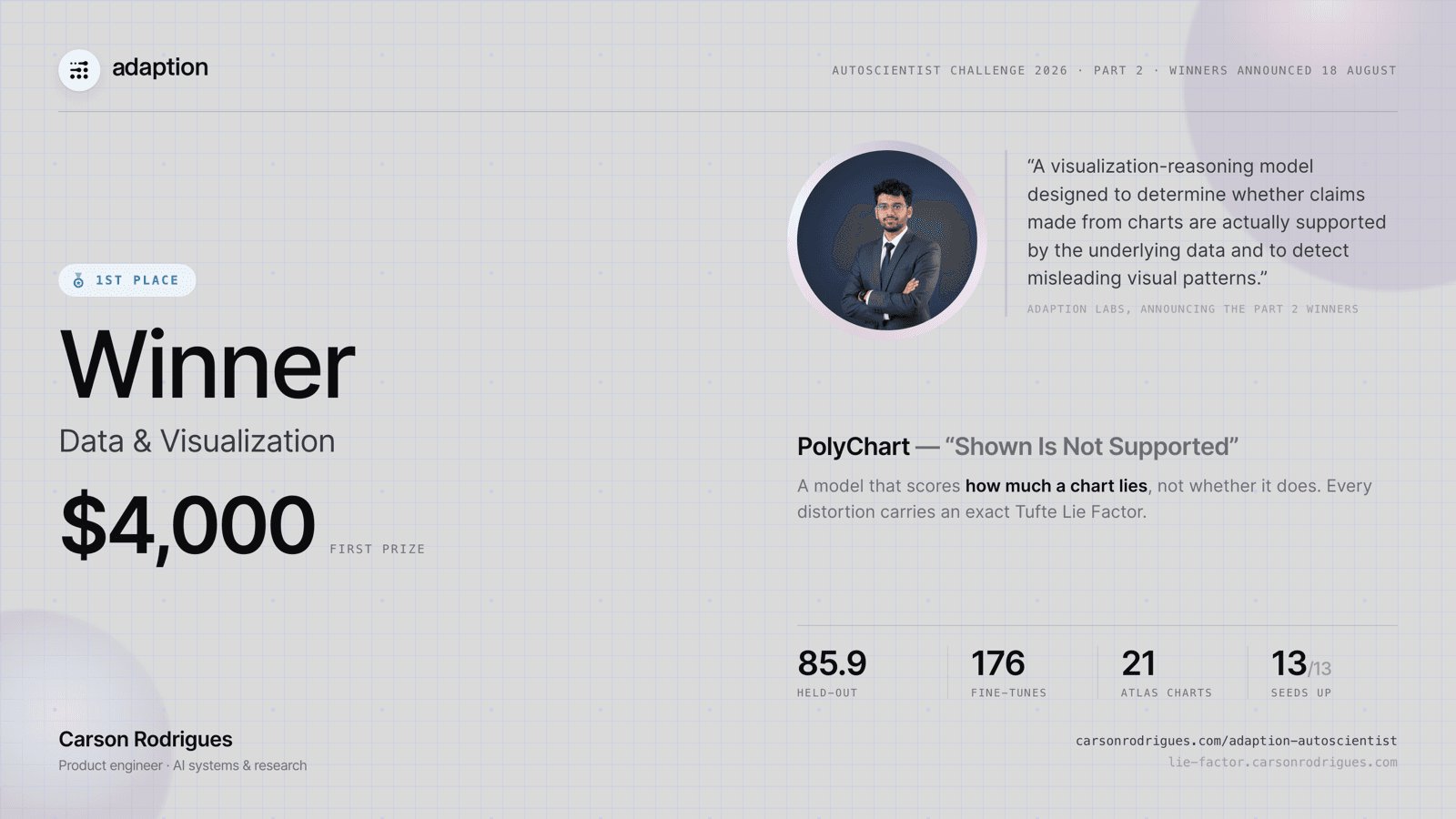
$4,0001st place in Data & Visualizationannounced 18 August 2026
“A visualization-reasoning model designed to determine whether claims made from charts are actually supported by the underlying data and to detect misleading visual patterns.”
Part 2 ran seven categories — Science, Agriculture, Personal Finance, Data & Visualization, Market Analysis & News, HR, and Math & Code — with a first and a runner-up named in each. The runner-up in this category was Vinod Anbalagan. The entry below is the one that placed; the other six shared the same model and the same thesis.
The automation that made it possible
To run at the scale this needed — 176 fine-tuning jobs across 86 launches and 13 datasets — I built a headless client for the AutoScientist API before the official one shipped, and drove everything through it rather than the interface. It is what made the paired within-seed design and the run count feasible. I have open-sourced it so anyone can build on it.
One idea, tested seven ways. Each category is its own dataset and training run, evaluated on the platform's held-out test set for that category. All seven share the single LoRA released below.
Data Visualization
1st place
85.9held-out
A model that scores how much a chart lies. Every distortion carries an exact Tufte Lie Factor, signed and continuous, not a yes/no label. Ships with a Deception Atlas of 21 real published misleading charts, each value checked against primary sources.
Scientific claims travel as charts, and a chart can be true in every value and still misrepresent its result. This checks the claim against the plotted data, not the picture.
News charts are the most published and least audited charts there are. This pairs chart reading with severity scoring, so a claim in a story can be checked against the figure that supposedly supports it.
Workforce reporting is full of traps: a comparison across differently defined cohorts, an axis choice that carries a conclusion the data does not. It reads participation and trend claims against the underlying numbers.
Quantitative reasoning over tabular and plotted data. Read exact values, compute ratios and rates of change, and refuse to answer when the number is not in the input. The refusal case matters as much as the arithmetic.
Financial charts are where misleading encodings do the most direct damage: a truncated axis on a returns chart, a percentage gain quoted without its base. It separates the visual impression from the arithmetic and reports the size of the gap.
Agricultural yield and input data, where long series and unit changes make trend claims easy to overstate. Measure first, then claim only what the data supports.
Two papers came out of this build. Neither is on arXiv yet; both are honest work in progress, and I will post the preprints here and in the Adaption community when they are up. The fuller list lives on my research page.
Under review at DMLR · Zenodo preprint
Silent Failure in Automated Model Adaptation
The measurement paper from this build. It instruments the platform across 176 fine-tuning jobs, 86 launches, and 13 datasets, driven headlessly through its internal API. Two findings, usually reported apart: the core capability works (synthetic augmentation improved the held-out score on 11 of 11 paired seeds, mean +14.4, 95% bootstrap CI 12.4 to 16.4, sign test and Wilcoxon p=0.0010, and the advertised +16 from crossing 20k datapoints reproduced at +17.4), and the reported numbers still cannot, on their own, separate a good adaptation from a bad one, with the displayed and held-out metrics disagreeing in sign in three of eight paired comparisons and the quality grade collapsing toward a fixed attractor. It defines silent adaptation failure, proposes six cheap machine-checkable audits, and reports a verifier that caught nine failures in the pipeline, four in its own scaffolding.
Quantifying Chart Deception: Continuous Deception-Severity Estimation for Chart-Reading Models
The model paper behind PolyChart. Charts can mislead without a single false number: a truncated axis or a mismatched area encoding changes what a reader concludes while every label stays accurate. It builds a counterfactually-augmented dataset directly from the distortion parameters used to render each chart, so the ground truth for deception is generated rather than annotated — 2,430 rows on a 33-field machine-checkable schema, 636 carrying an exact Tufte lie factor — plus a held-out Deception Atlas of 20 real published misleading charts verified against primary sources. Training a continuous severity estimator with reinforcement learning from verifiable rewards is pre-committed in an analysis plan fixed before any run.